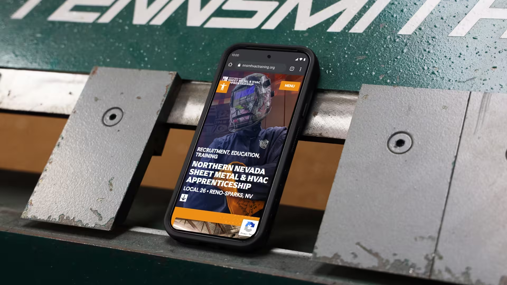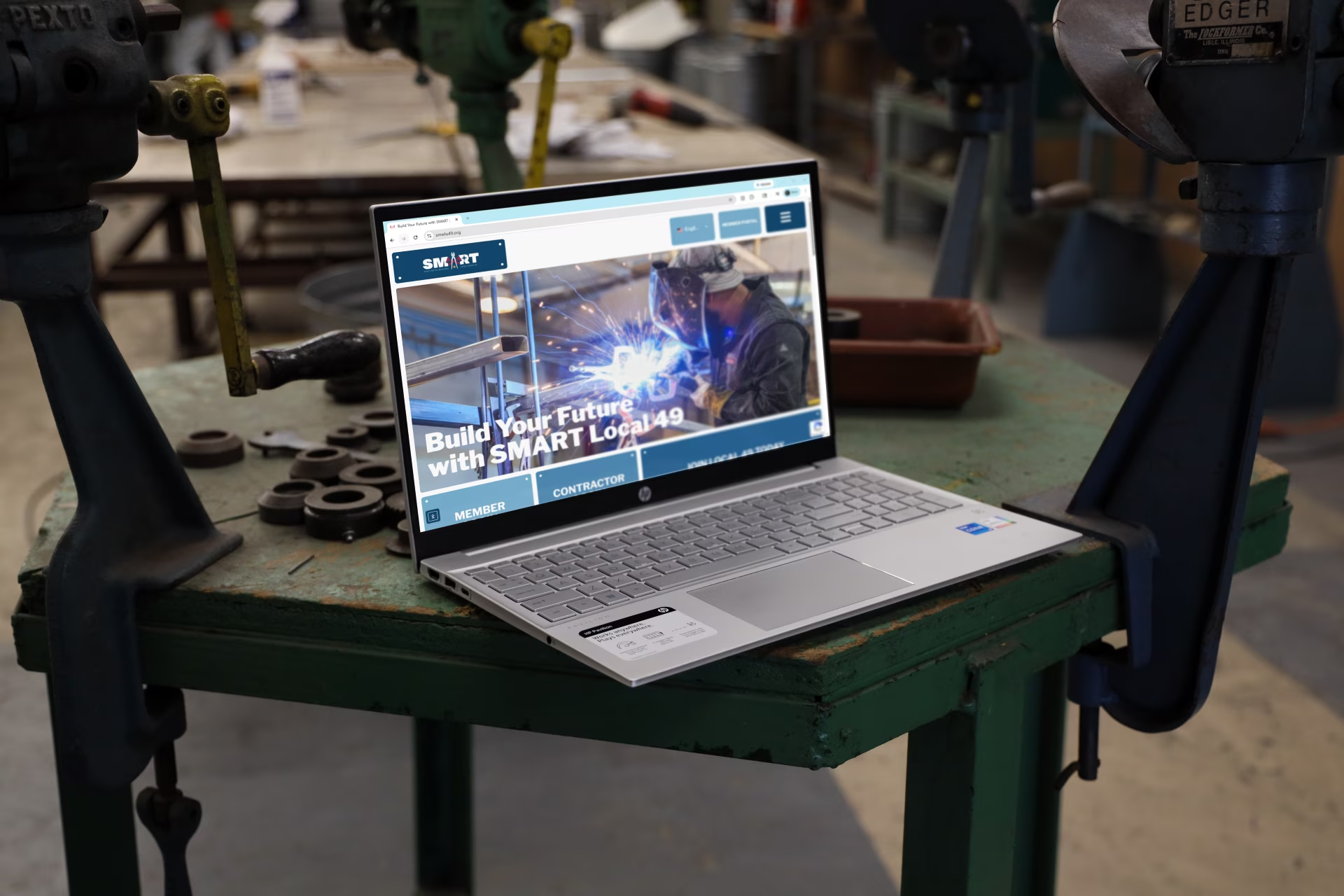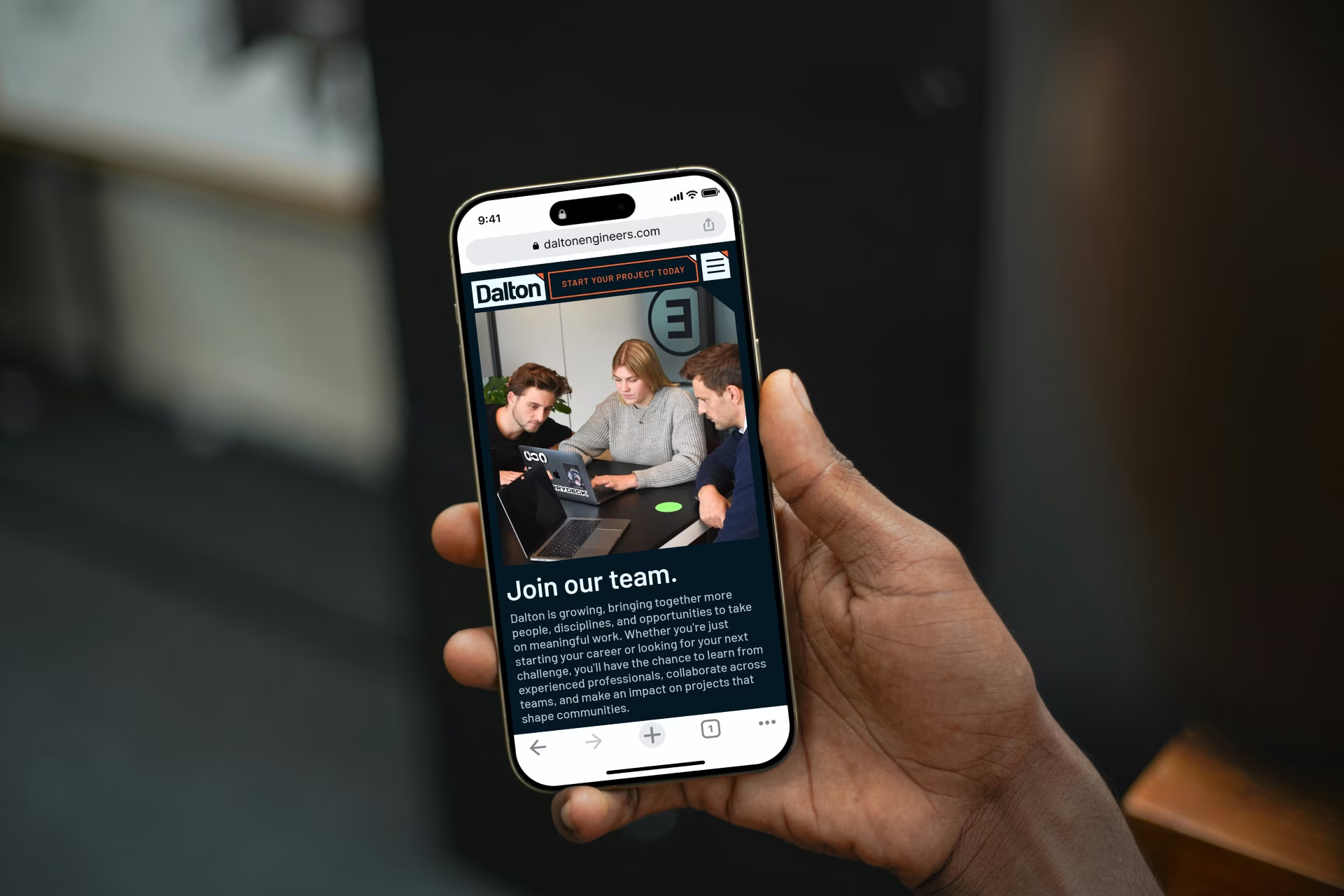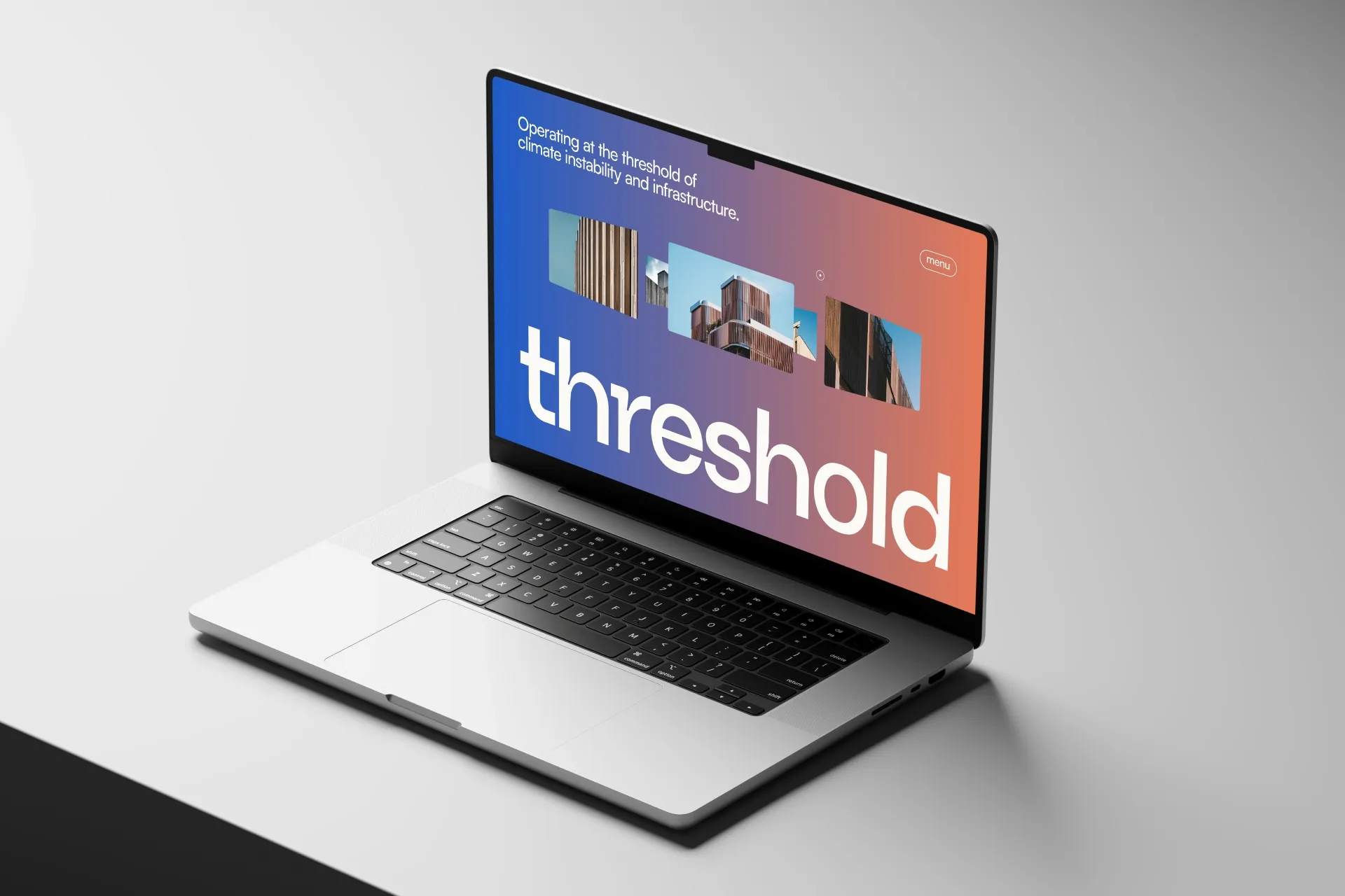
Quick answer: Most architecture and engineering firm homepages lead with strong project photography but fail to answer the most basic question a first-time visitor is asking: is this firm relevant to me? A few clear lines explaining who you work with and what you're known for can be the difference between someone staying on the page or leaving in thirty seconds.
What You See When You Land on Most AEC Firm Homepages
A full-bleed project photo. Beautifully shot. Possibly a slow pan or a fade sequence.
Then nothing.
No explanation of who the firm is. No sense of who they work with or what they specialize in. Sometimes you have to click three or four pages deep before you encounter a single sentence that actually describes the firm.
This is the most common homepage mistake I see when reviewing architecture and engineering websites. And it's worth talking about because it's so easy to fix, and the cost of leaving it unfixed is real.
Great Photography Isn't the Problem
To be clear: leading with strong visuals is the right instinct. Project photography matters. It sets a tone, establishes credibility, and communicates quality faster than words can.
The problem isn't the photography. The problem is when photography is doing all the work, and the homepage has nothing else to say.
A beautiful image answers "can this firm produce good work?" It doesn't answer "is this firm the right one for me?"
Those are two different questions. And the second one is the one your visitor is actually trying to answer.
The Thirty-Second Reality
Most people give a website thirty seconds, maybe less, before they decide whether to keep exploring or leave.
In that window, a first-time visitor, whether it's a prospective client, a potential hire, or someone who just got a referral and is doing a quick check, is running a basic filter. They're not looking for your full story yet. They're just trying to figure out if you're worth their time.
If the homepage is only visuals, you're asking them to do all the interpretive work themselves. Some will. Most won't.
The firms that hold attention are the ones that make it immediately obvious who they are and who they serve. Not through a paragraph of marketing copy. Just a few lines. A clear statement of what the firm does, who it does it for, and what makes it worth paying attention to.
That's not a small thing. It's often the difference between a bounce and a conversation.
The Coffee Table Portfolio Problem
There's a specific failure mode that shows up on a lot of AEC websites. The site is visually polished, the photography is excellent, the project pages are detailed. But the overall experience feels more like flipping through a portfolio book than visiting a business.
A portfolio says: look at what we've made.
A website, used well, says: here's who we are, here's who we work with, here's why that should matter to you.
The distinction matters because the people visiting your site aren't just admirers. They're evaluating you. They're deciding whether to reach out, whether to add you to a shortlist, whether to pass your name along to someone else. Those decisions happen faster than most firms realize, and they're shaped by clarity, not just craft.
A website that behaves like a coffee table book puts the burden on the visitor. A well-positioned website does some of that work for them.
What the Homepage Actually Needs to Do
This isn't an argument for cluttered homepages or long blocks of text above the fold. Visual-first design can absolutely still lead the experience.
But somewhere in the first scroll, usually paired with or immediately following the hero image, a visitor should be able to answer three questions without clicking anywhere:
What kind of work does this firm do? Not every project type they've ever touched. The work they want to be known for.
Who do they work with? A clear sense of client type, sector, or project scale goes a long way. It helps the right people self-identify and helps the wrong ones self-select out, which is also valuable.
What makes them worth paying attention to? This doesn't need to be a tagline. It can be a sentence. A point of view. A specific claim. Something that distinguishes this firm from the seventeen other firms in the same search results.
None of this has to be long. It has to be clear.
What Belongs Above the Fold
The part of the homepage visible before anyone scrolls has one job: tell a first-time visitor they're in the right place. For an AEC firm, that usually means four things.
1. A clear headline. What kind of firm this is and who it's for. Not a slogan that could describe any firm in the city.
2. A supporting line. One sentence that adds specifics: the sectors you work in, the project scale, the region.
3. A specific call to action. "Contact Us" is vague. "See Our Work" or "Start a Project" tells the visitor what happens next.
4. Early proof. A recognizable client, an award, a project count, or a short testimonial. Anything that says other people already trust this firm.
The project photography can still lead. These four things just need to sit with it or immediately after it, so the visitor isn't left to figure out the rest on their own.
A Quick Test
Pull up your homepage and set a ten-second timer.
By the time it runs out, can a stranger answer the three questions from the section above. Not after reading every page. Just from what's visible in those first ten seconds.
If the answer is no, the fix usually isn't a redesign. It's a few lines of purposeful copy placed where a visitor actually looks.
The easier it is for someone to understand who you're for, the more likely they are to reach out. That's what a homepage is for.