Oak Prairie Woodworks
A craft-focused wood products brand in Eugene, Oregon, built from deep construction roots, needed a distinct identity that separated it from its parent company while honoring its heritage. Through Brand Strategy, Brand Identity, and Website Design, we created a brand grounded in craftsmanship, sustainability, and modern maker culture.
Brand Strategy
Brand Identity
Website Design & Development
Oak Prairie Woodworks was born out of O’Brien Construction’s long-standing history in building and craftsmanship in Eugene, Oregon. Created as a dedicated space for experimentation and small-batch wood products, the brand represented both a continuation and an evolution of the company's hands-on making culture.
The challenge was to establish an AEC brand identity that felt meaningfully separate from the construction company while still honoring its lineage of skill, care, and material understanding. Oak Prairie needed to stand on its own as a contemporary woodcraft brand, not a side extension of a construction firm.
At its core, the project wasn't just about visual identity. It was about defining how a modern maker brand could express heritage, sustainability, and craftsmanship in a way that felt intentional and refined.
This project sits at the intersection of brand strategy and small business identity development, where story, material, and process all shape perception.
We began by looking beyond products and services to understand what Oak Prairie truly represented.
The brand emerged as a reflection of family values, Oregon’s maker culture, and a commitment to thoughtful, sustainable production. That foundation became the guiding principle for the entire identity system.
The goal was to balance authenticity with refinement, capturing the honesty of woodworking without relying on predictable rustic visual language. Instead of leaning into clichés often associated with craft brands, we developed a system that felt grounded, contemporary, and intentional.
Handcrafted typographic elements introduced warmth and human touch, while a structured layout system provided clarity and modernity. The contrast between the two created a brand that feels both artisanal and professional.
As a studio focused on Brand Identity and Brand Strategy, we approach maker-driven brands by first understanding the emotional and cultural context behind the work. The strongest identities don't just represent products, they express the values behind how things are made.
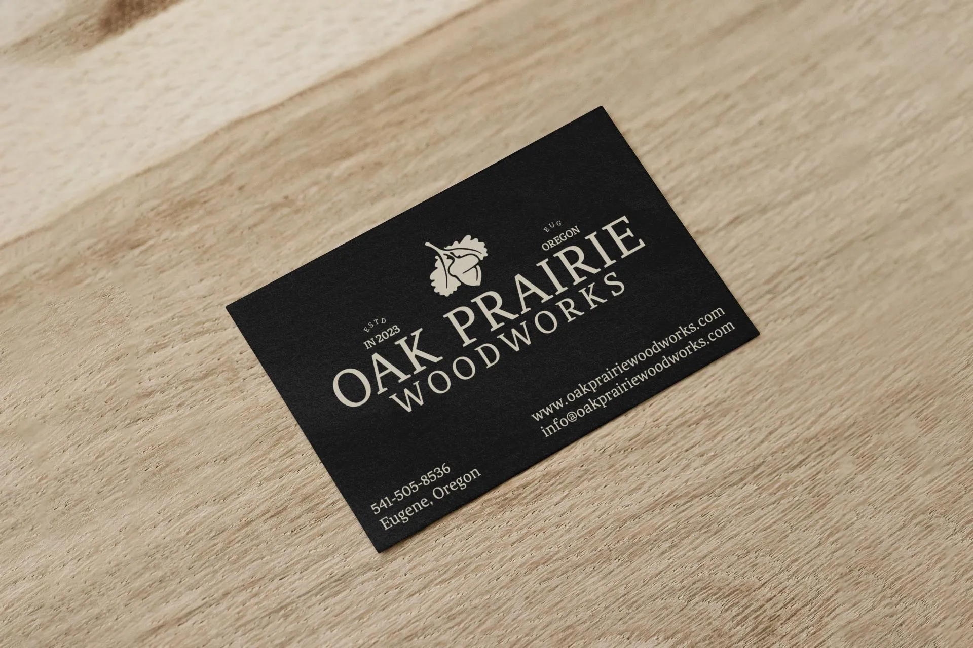
The final identity gave Oak Prairie Woodworks a clear and distinct presence that separated it from its parent construction brand while maintaining a subtle connection to its origins.
The system positioned the brand as more than a woodshop. It became a reflection of craftsmanship, sustainability, and intentional making - qualities that resonate strongly within contemporary maker culture.
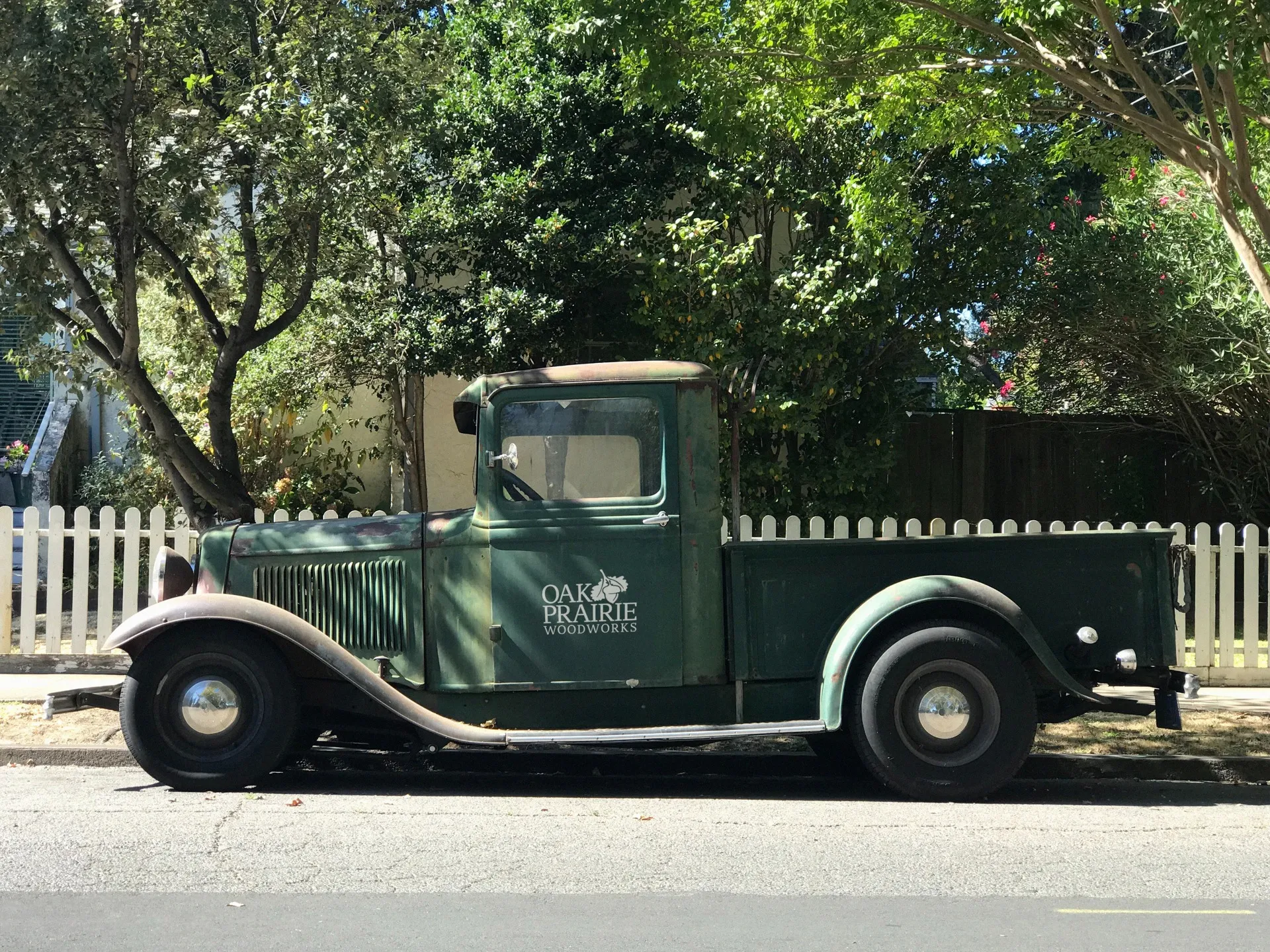
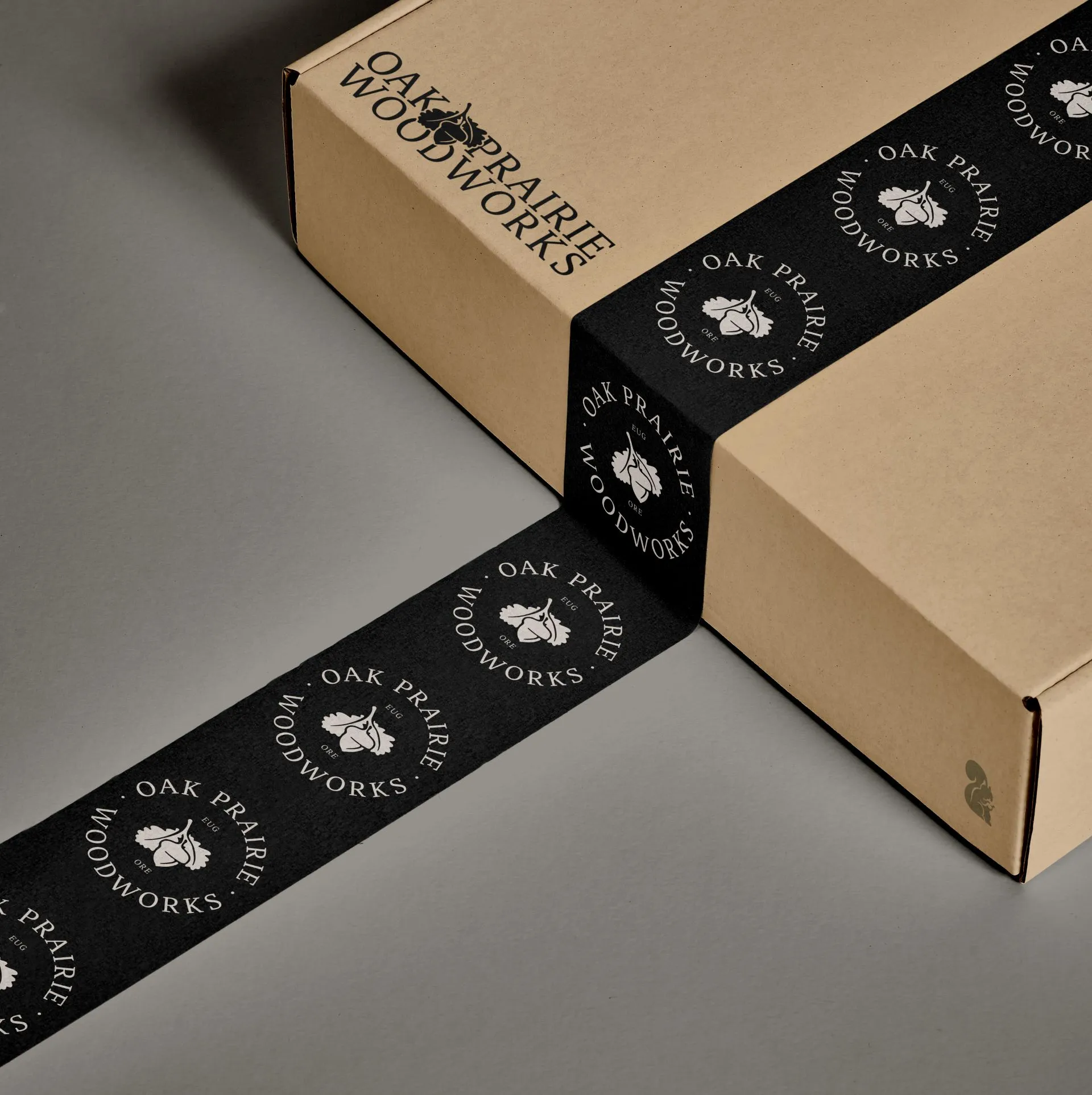
The identity was designed to feel timeless and flexible across applications, from packaging and product branding to digital and print touchpoints. Every element reinforces the same idea: thoughtful work deserves a thoughtful presentation.
What Changed
- Oak Prairie Woodworks launched with a brand that separated it clearly from its parent construction company — a distinct identity for a craft-focused wood products business that could stand on its own
- The brand connected the company's deep construction heritage to a contemporary maker culture sensibility — honoring the roots while opening the door to a different kind of client relationship
- The identity, website, and visual language communicated craftsmanship and sustainability as core values rather than marketing claims, visible in every design decision
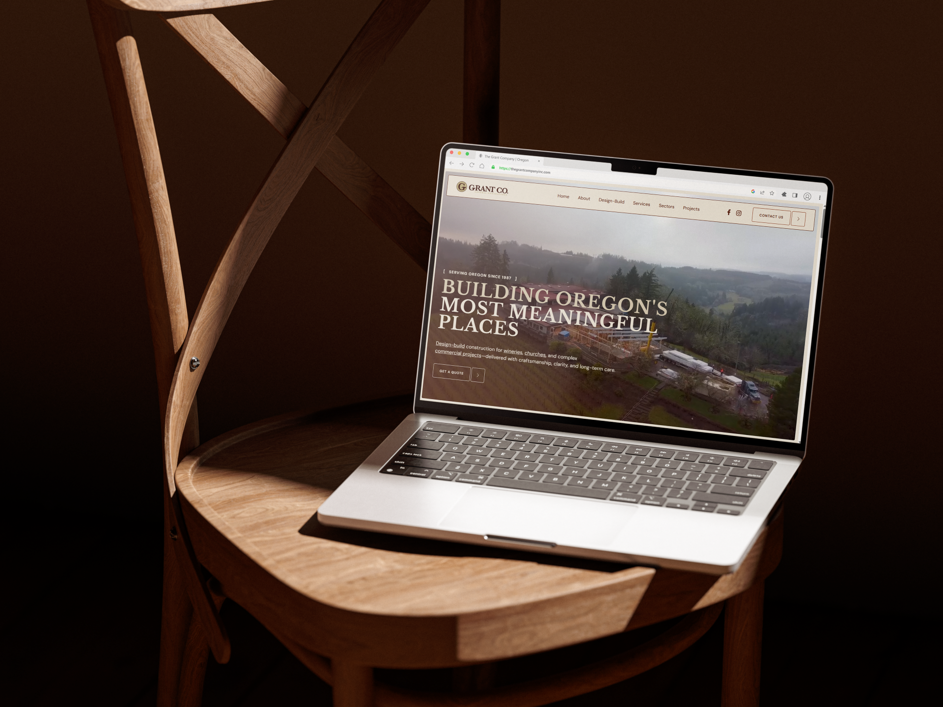
- The company now has a digital presence that can support growth into retail, wholesale, and direct client relationships — not just a reflection of current operations but a platform for where the business is headed
This project demonstrates how Brand Strategy for small makers and craft-based businesses can elevate perception without losing authenticity. When done well, branding doesn't change what a business does, it clarifies why it matters.
Ready to start a project?