Dalton Engineers
Dalton Group is a growing engineering firm built on nearly four decades of experience. As the company expanded through new disciplines, offices, and acquisitions, its founder-named identity no longer reflected the organization it had become. We developed a new brand that retained the equity of the Dalton name while creating a shared identity built for continued growth.
The Project
Brand Strategy
Brand Identity
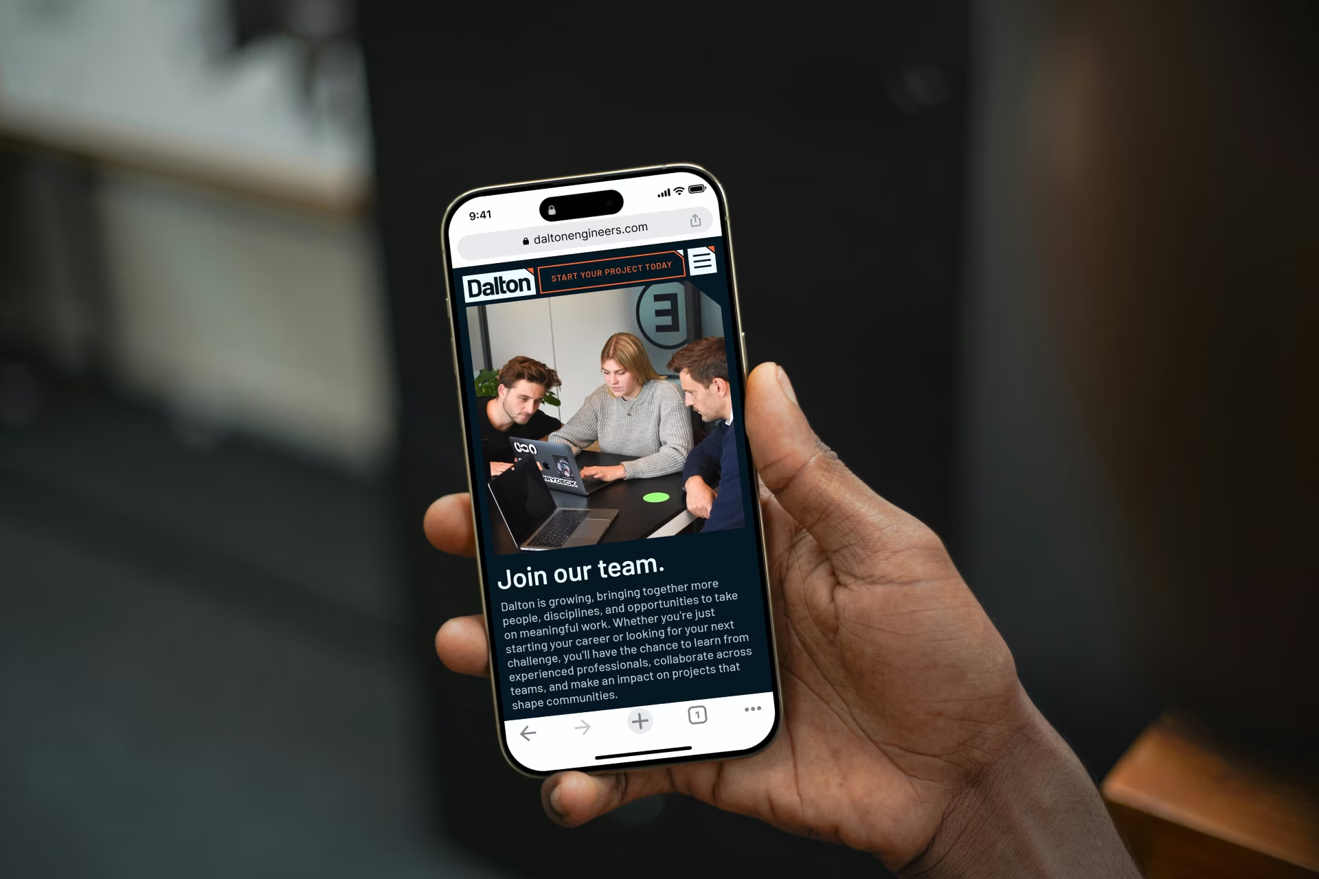
Website Design & Development
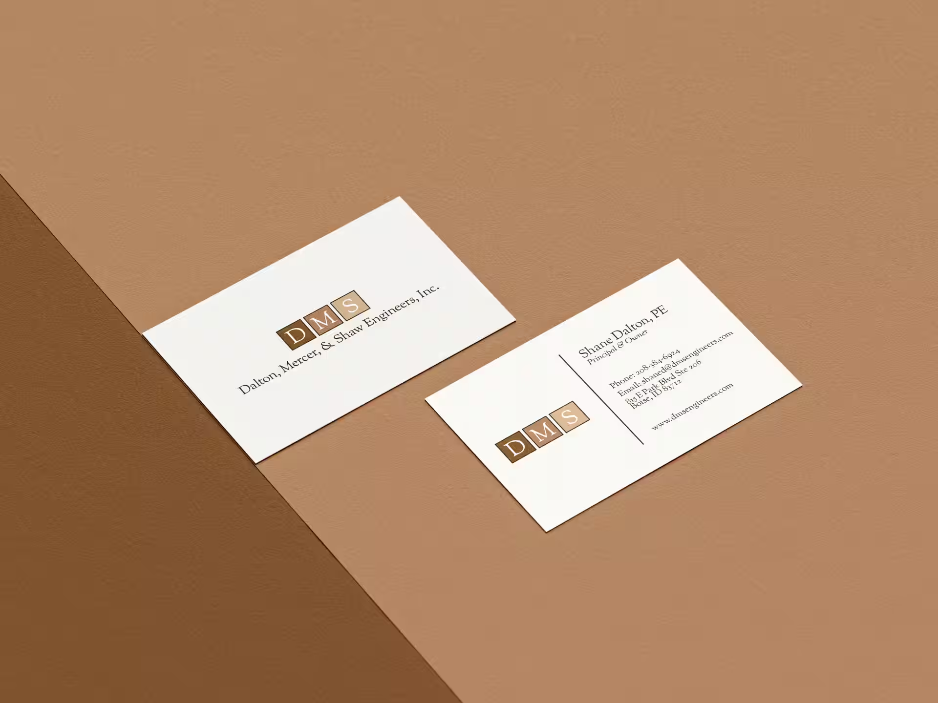
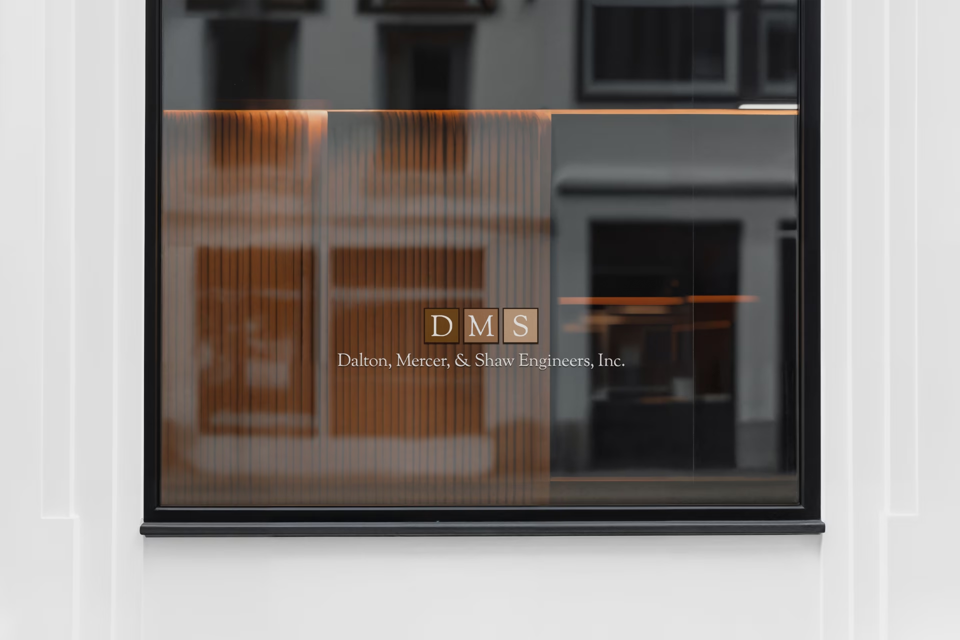
Dalton, Mercer, & Shaw Engineers had grown significantly since its founding in 1988. The company had expanded its capabilities, welcomed new teams, and grown through the addition of established regional engineering firms.
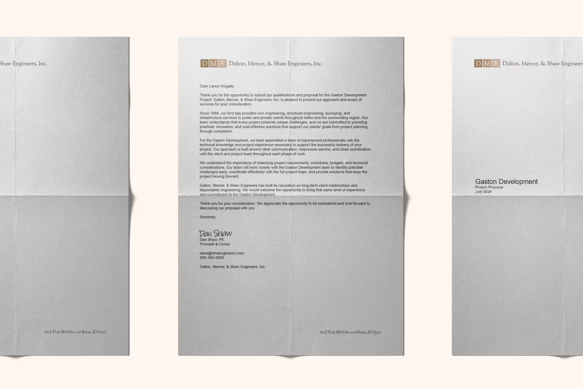
But the brand still reflected an earlier version of the business.
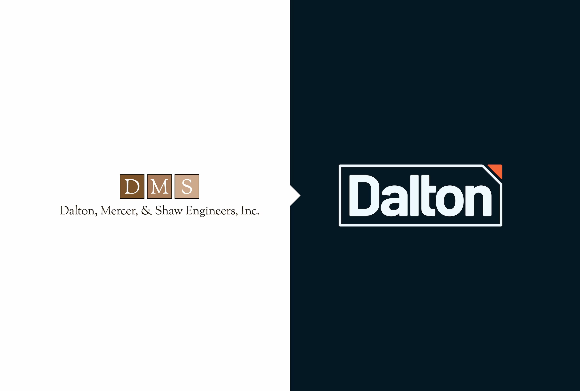
The long founder-based name was difficult to use and increasingly disconnected from the size and structure of the organization. More importantly, it left little room for future growth. As Dalton looked toward its next chapter, the company needed an identity that could bring its existing teams together while creating a clear place for the people and firms that would join them in the future.
The solution was not to abandon the history behind the name, but to simplify it.
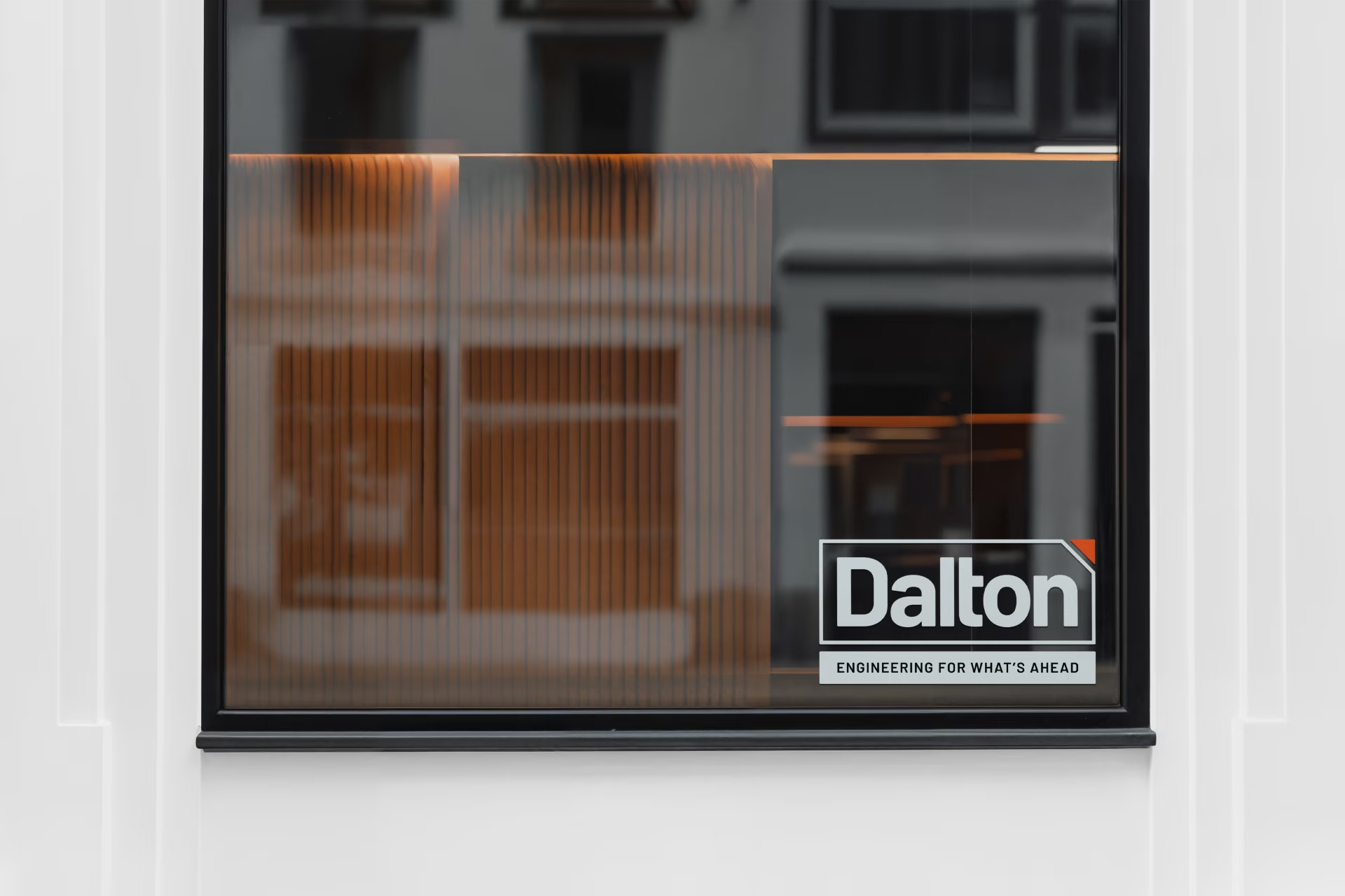
Dalton retains the equity of the Dalton name while shifting the brand from a collection of individual names to one shared organization.
Our Approach
We began by identifying what was worth carrying forward. The Dalton name had decades of recognition behind it, while the individual names and outdated visual system were increasingly limiting the organization.
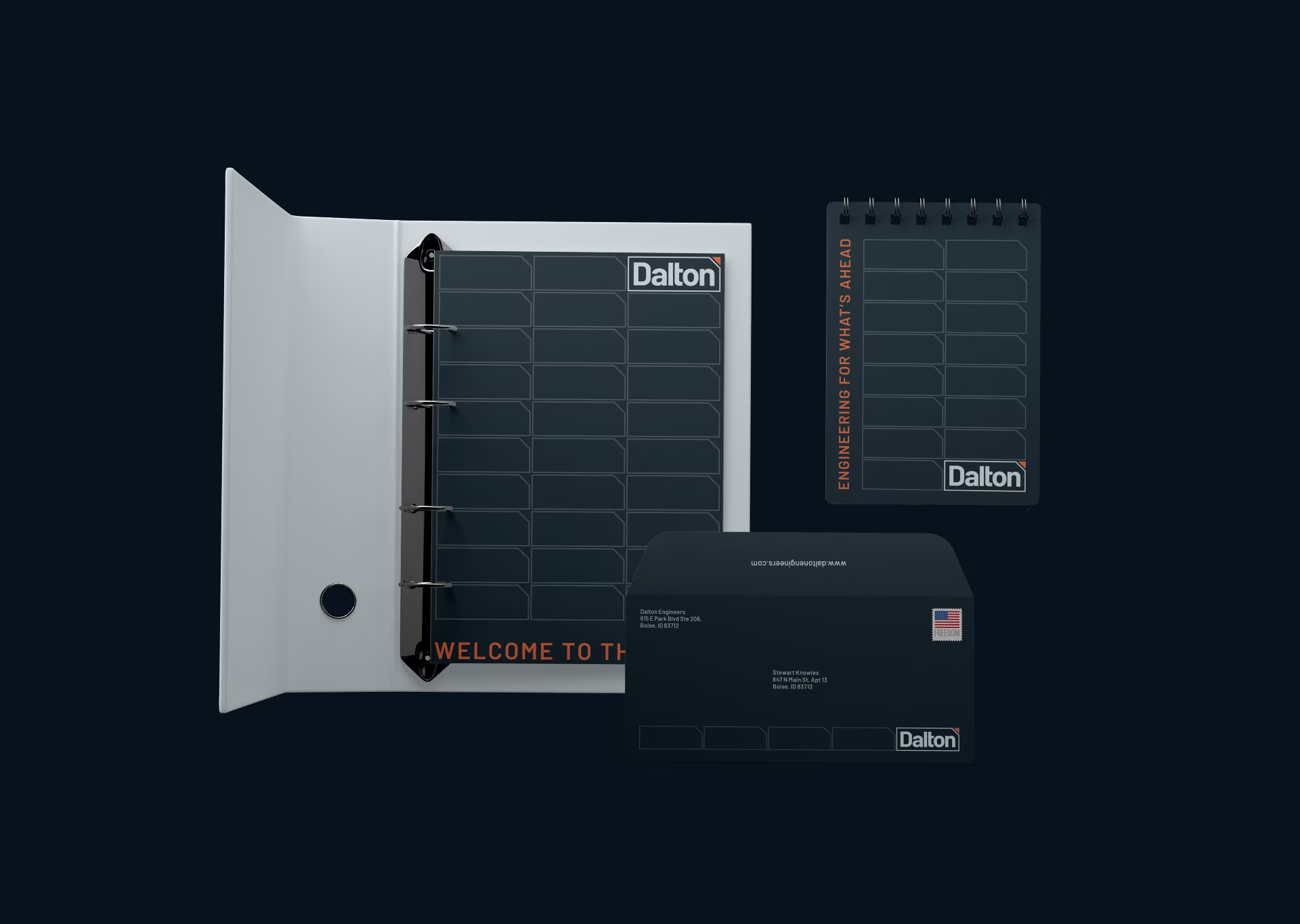
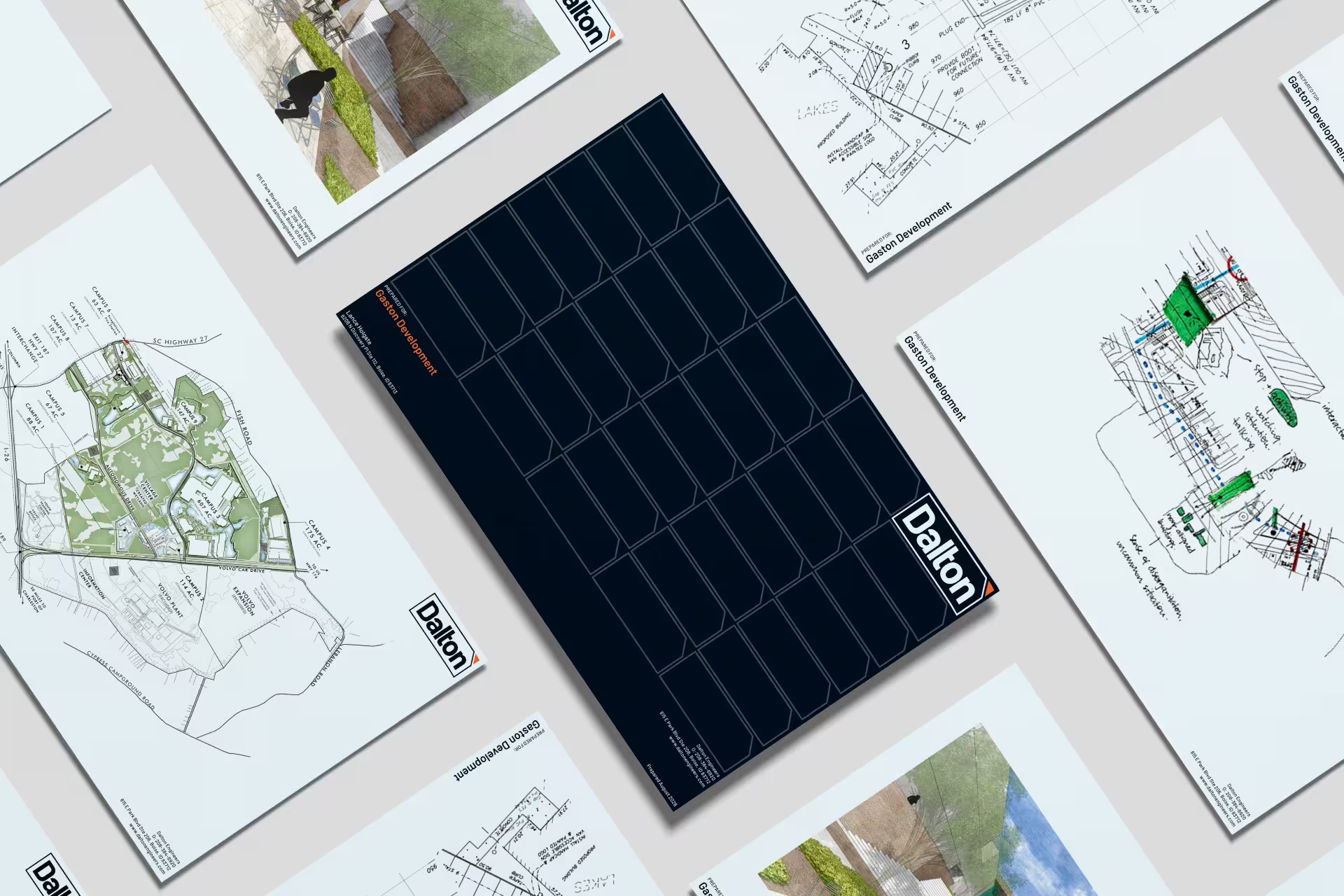
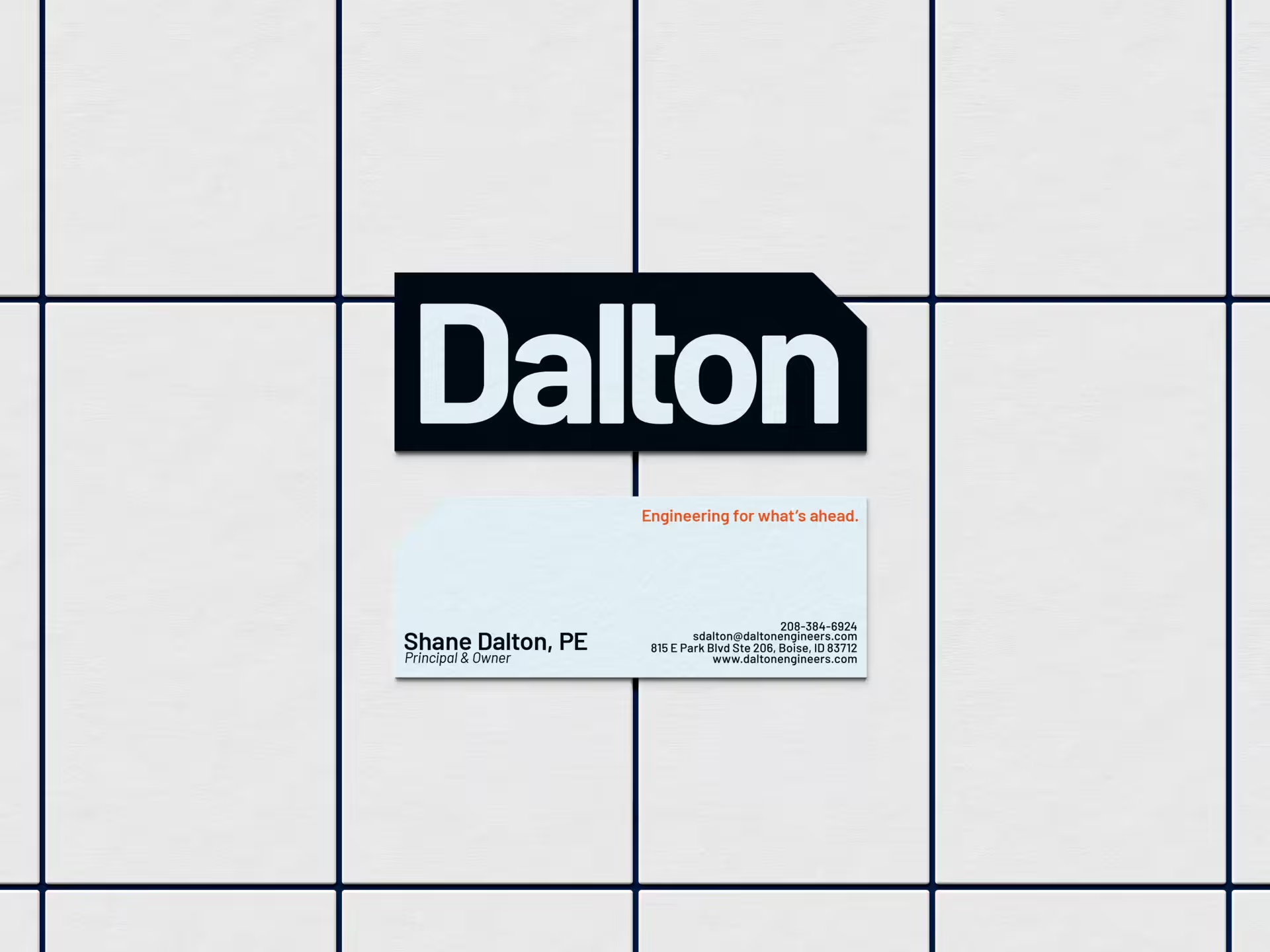
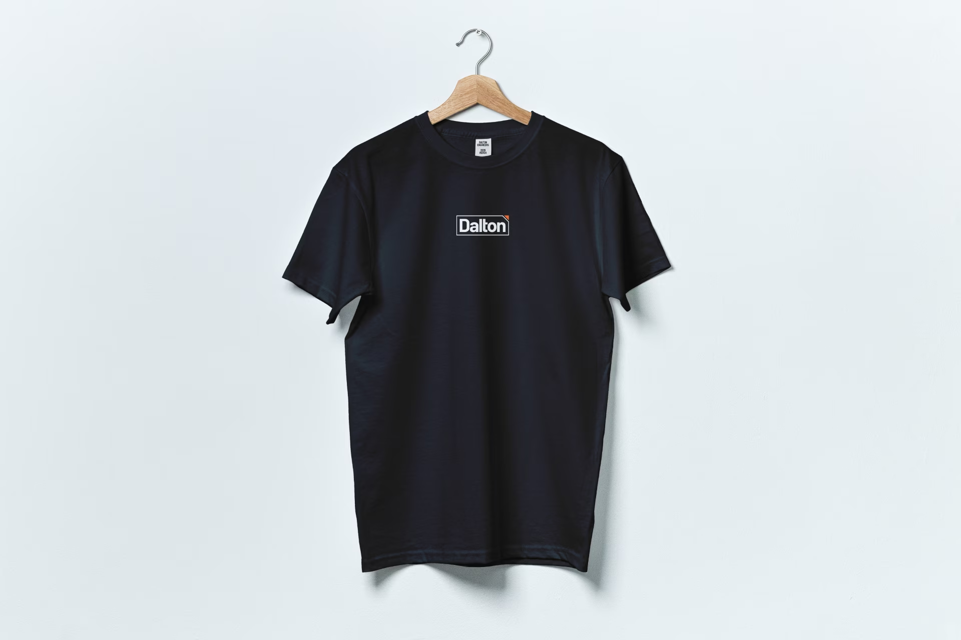
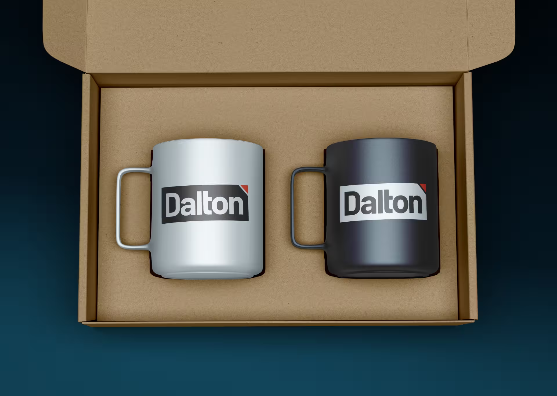
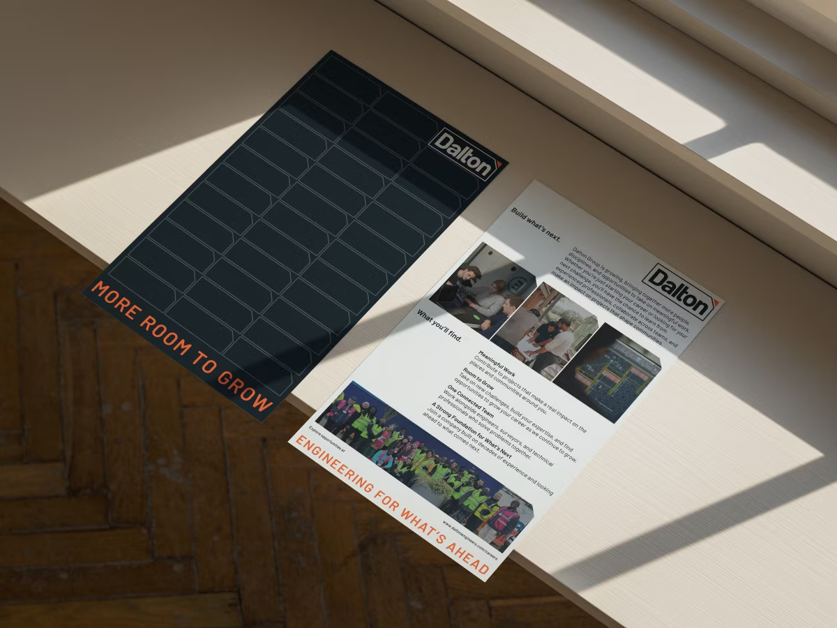
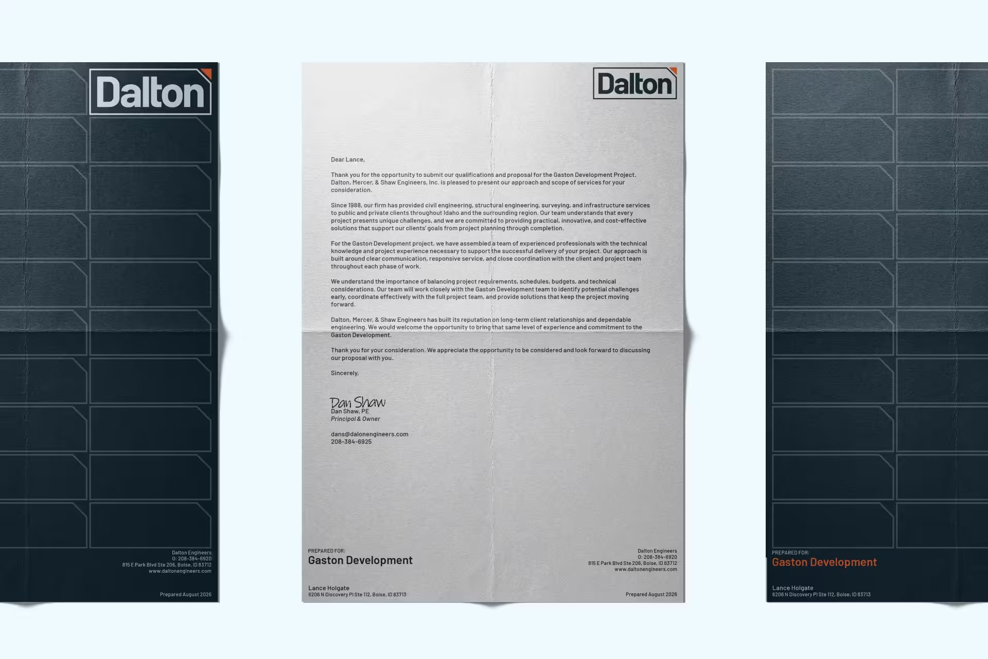
The new identity centers on Dalton as the primary brand establishing the broader organization behind it. The visual system was designed to feel established and capable while giving the growing company more flexibility across disciplines, teams, offices, and future acquisitions.
Rather than relying on traditional engineering imagery, the identity uses a disciplined typographic system, strong hierarchy, and a flexible graphic language to communicate clarity, coordination, and scale.
The result is a brand that feels like an evolution of an established firm, not a company trying to reinvent itself.
The Outcome
Dalton now has a unified identity designed to support the organization it has become and the company it intends to build.
The new brand creates a common foundation for teams coming together under one name, while providing the flexibility to grow into new markets, disciplines, and acquisitions.
Most importantly, the identity preserves the value of where Dalton came from without allowing its history to define where it can go next.
One name. More room to grow.




Ready to start a project?