
Location:
Eugene, Oregon
Type of Work:
Website Design & Development
Completion Date:
July 2024
Eugene, Oregon
Website Design & Development
July 2024

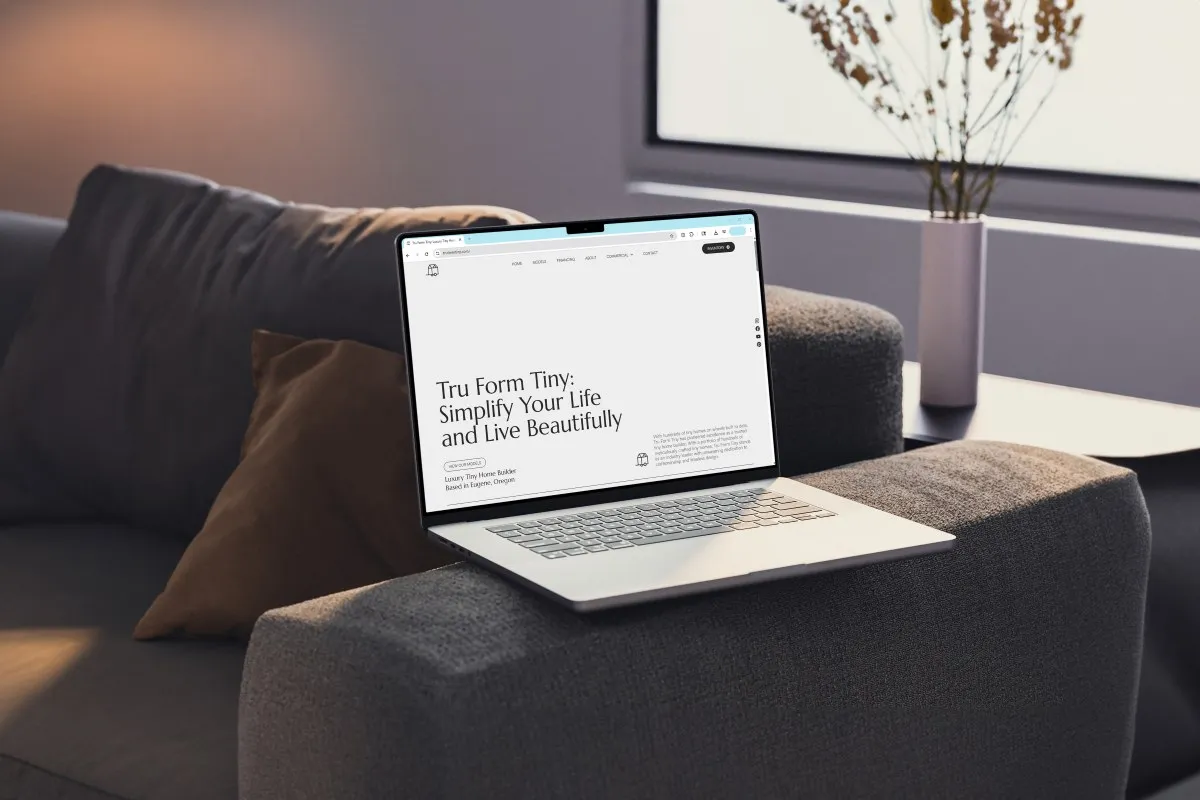
Tru Form Tiny builds some of the most beautifully crafted tiny homes in the country. Their product was exceptional. Their reputation in the industry was strong. And their website was actively working against them.
The site did not communicate the quality or craftsmanship of what they were building. The design felt generic compared to the level of detail in the homes. Navigation made it difficult for potential buyers to explore and compare models. And the sales team was being flooded with inquiries from people who were interested but not qualified. They were spending hours on conversations that went nowhere because the website had not done its job of setting expectations around price, timeline, and fit.
The core problem was not a design problem. It was a positioning and systems problem that showed up in the design. The site was not built for the buyer Tru Form actually wanted to attract.
We started with positioning before touching a single design element. Tru Form Tiny was not just a builder of compact houses; they were a designer of beautiful, livable spaces for people choosing a specific kind of life. That distinction mattered enormously for how the site should look, what it should say, and who it should speak to.
From that foundation, three strategic priorities shaped the entire project.
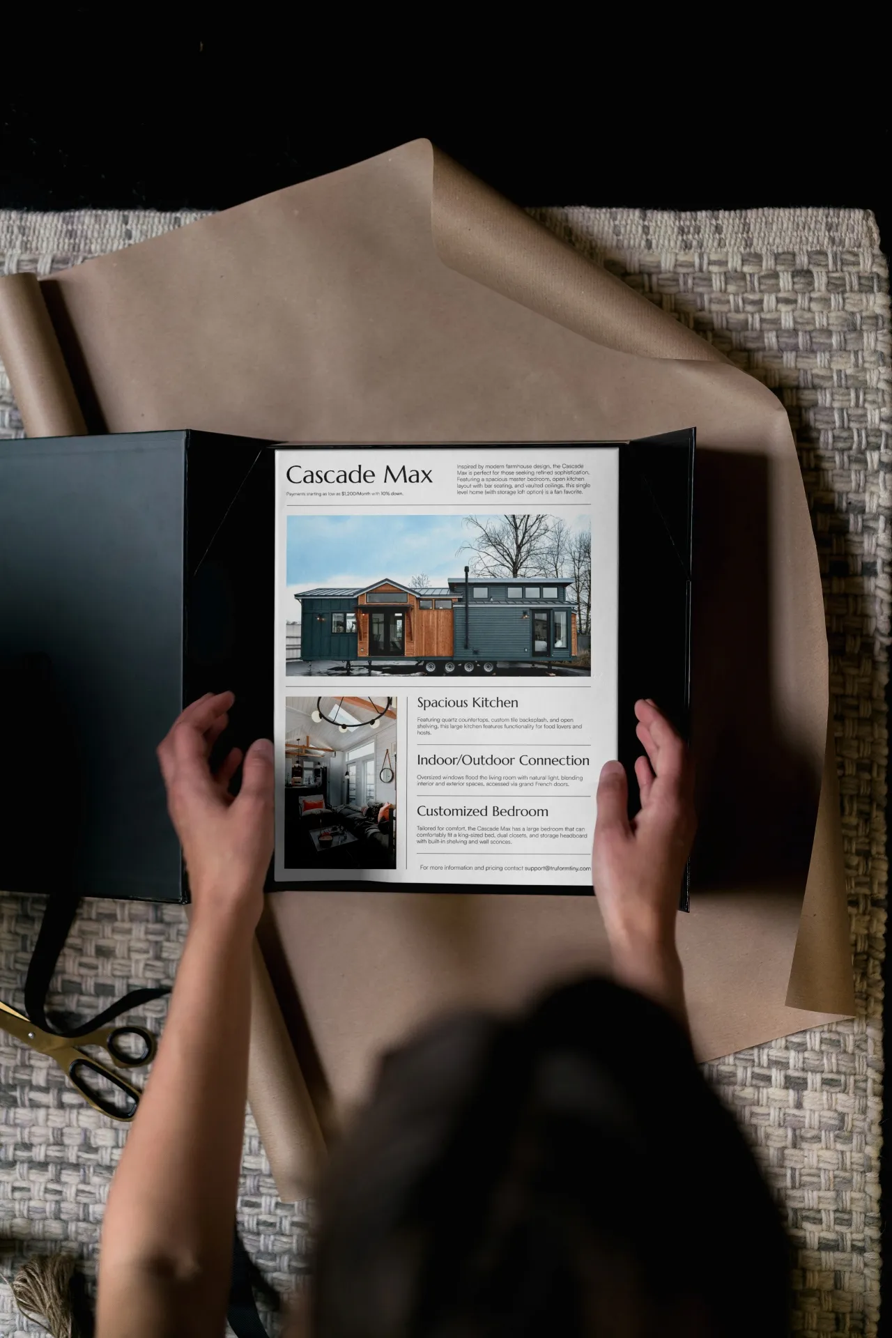
Positioning for the luxury market. The visual language, the copy tone, the photography treatment, and the overall site experience were rebuilt to reflect the quality and craftsmanship of the homes. Every design decision was made through the lens of: does this feel like a brand that builds $200,000+ custom homes?
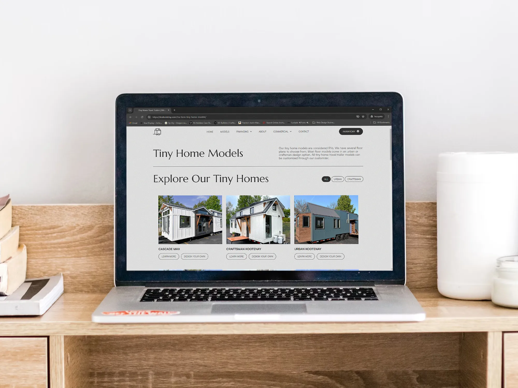
A buyer journey that matched how people actually shop for a tiny home. We restructured the navigation and content flow so potential buyers could find, compare, and understand models without friction. The goal was to give serious buyers everything they needed to self-qualify and move forward. And give browsers a clear sense of whether this was the right product for them.
Lead qualification built into the site architecture. The previous site was generating volume without quality. We rebuilt the inquiry flow to pre-qualify leads before they reached the sales team; surfacing price ranges, timelines, and customization options earlier in the experience so that by the time someone reached out, the basic fit questions were already answered.
The new site positioned Tru Form Tiny as a leader in the luxury tiny home market and fundamentally changed how their sales process worked.
The sales team now spends more time with buyers who are ready to move forward and less time managing inquiries from people who were never a fit. Lead quality improved significantly. The site became a genuine sales tool, not just a marketing presence, and continues to evolve based on feedback from the team and their buyers.
Tru Form Tiny remains an active client. The site is managed on a monthly care plan, with ongoing refinements to landing pages, user experience, and conversion flow as the company grows and the market evolves. This project is one of the clearest examples in our portfolio of what a website looks like when it is treated as a living business tool rather than a one-time deliverable.
Visit the site: www.truformtiny.com
A veteran-led construction firm with over four decades of industry expertise needed a digital presence built for the federal marketplace. We designed a site that communicates credibility, capability, and mission — clearly and without noise.
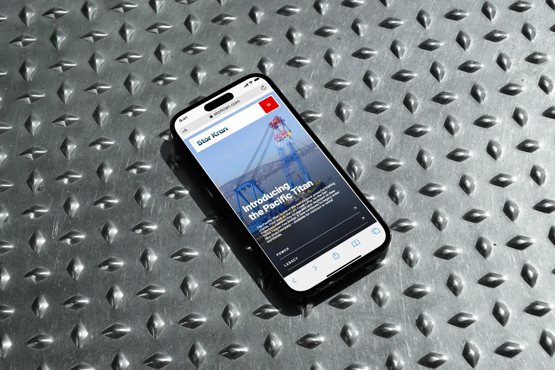
A new company launching around one of the largest floating cranes on the West Coast needed to establish credibility fast.
We modernized the brand and built a website with one job: make the scale and capability of the Pacific Titan immediately clear to anyone who lands on it.